Monday, June 22, 2020

Pat's Ultimate Comic Style Challenge: Phase 1 JOE MADUREIRA -Challenge-FAIL!!


Okay, what I set to do for this challenge was to discover more about those artists that I think are really cool and try to replicate their style. the first phase of my multi-day challenge is to replicate the art style of Joe Madureira. I needed to put myself into his space and come out of my own. My point was to learn how the artist sees and thinks. So with a lot of images, Youtube videos, and fan web sites visited, I accepted this challenge!!!


What I admire about the art of Joe Madureira:

  1. I am just awestruck that Joe Madureira’s pencils are so tight and clear to read that they are comic ready without inking. This is seen in his Marvel works after his Battle Chasers comics run. In those later issues, they were just coloring over the pencils.  This style would usually make the art look muddy- but appears to work for his style. A style that he seems to have perfected during his concept and poster work during the early 2000s. He would use this style in panel work while working with Udon and Capcom for the Streetfighter Comic series.  This style is liberating for an artist,  since your true lines are being depicted in the final art


  1. I also admire the simplistic form. His loose but well-defined layouts make the coloring of the piece more creative for the colorist. It reminds me of creating a boxy shape- the more you know how to draw a box in space, the more dynamic your characters and layouts can be. I am reminded that he deals with contour a much as drawing through an image


  1. Joe Madureira is a master of face and hand construction. One may argue he is weak here.  I would disagree. I believe it is easier to draw a face or hand from reference if it is a copy of the reference, but it takes a strong knowledge of construction to stylized the feature and make it seem solid rather than flat. His hand gestures with this cartoony style are some of the most expressive and powerful posing in modern comics.


Okay, what I don’t like:


  1. There is not much I don’t like or can be critical of his style. But like many artists in comics the belief of darkness is better will always be my Achilles’ heel.  The term “when in doubt black it out” is used often, even in his work. Sometimes this is used perfectly to increase mystery and aid in storytelling- sometimes it just gets confusing. I will note that perfection in comics is fallacy. And one who pursues it relentlessly- never completes adequately, or can keep working for long. So Joe Madureira’s art-style works for me. Even though it’s not appropriate for all stories.


  1. As stated his artwork won’t work for all stories because there is a power and dynamics in his work that does not say “subtle”. So stories that require a flexible or patient mood-building story-telling will be a challenge. Nevertheless, his storytelling is clear and readable. So If he ever decides to tackle a  more introspective or character-building tale rather than an action-packed event. He may just be able to handle it.


Visual Breakdown of Style


Influences:
Wikipedia suggests Joe Madureira’s style was greatly influenced by Art Adams, but I don’t see that as clearly as I would suggest that he has influences bases on Anime art styles from Japan and manga from Chinese comics. His clean shadow and plane shapes remind me of cel-shading on an animation cel. That may be the attraction to his art- it is immediately akin to animation which has to show action quickly and subconsciously. 


He uses simple shapes to construct his characters and similar to animation used forced perspective and foreshortening used in anime to make his characters pop. I don’t see this much in Art Adams work- but I will give him the good looking pin-up girl character look that Art Adams trademarks in most of his images. 


A boxy style motif seen in design

Finding Patterns:


 I see a recurring 5 point box shape in many of the images Joe Madureira generates in his characters for concepts and panel work. I see that his images sometimes work as contours rather than sold drawings or drawing through elements.  This I believe is a short cut method for getting the image complete and because he has so much visual memory get right most often.


At first, all I saw were a lot of straight lines that make up his compositions. A linear motif as it were- but he has so many curves in looking at hair and hands. It a radical edgy mix of curves and straight lines that makes his style unique.  I can see the Art Adams touch here where curves play more of a part.  It appears as if he is carving out his form from the inside of a box which is opposite on how many people see comic art. It’s very appealing.


Can this be replicated:

My naive mind would say, “this is a piece of cake”,  and “I can do that”.  Hahaha- How wrong I was to boast such a claim- There is a reason that Joe Madureira can work in both the Comics and the RPG video game arena. It’s a slimmed-down style that is efficient and clear to read. That is generally not an easy task. Making a cool image is one thing.  Comic artists get caught up in the detail and minutia.  But creating designs that are comic ready and inspire other projects is about communication- that is more universal than making a cool image.
I tried it and my verdict is that I failed- I believe I Failed- Forward- See what I mean…


Okay on to the next Art Style Challenge- J. Scott Campbell- another head beating experience

Tuesday, June 16, 2020

Pat's Ultimate Comic Style Challenge

Okay, I have 1 month to complete this challenge- called the Ultimate Comic Style Challenge. I have seen several artists try to create their characters in various art production styles- but I have yet to see a breakdown of creating art that is similar to other comic artists- I will plan it like this- for the first round I will pick 10 comic artists I admire- I will try to first to "See" their work, being critical of what I like and what I don't like- remember this is style and there is a logical reason everyone's work looks different. I will then practice breaking down these styles by drawing on top and alongside the images, I will then see if I can create my own character using their identified art styles.  I understand this will take longer than one sitting to do since I am biased to what I perceive and that will have to be broken apart to do this challenge justice- or else I am trying to copy a poor comparison or a "Bad Copy" of these artists' works-. The ultimate goal of this challenge is to learn along the way to make my own art better.  I will at month-end post all the images I created as one piece. My first ultimate comic art style challenge  roster is:
Joe Madureira .. J. Scott Campbell .. Jim Lee .. Humberto Ramos .. John Buscema .. John Romita Jr .. Jason Pearson .. Olivier Coipel .. Otomo Katsuhiro .. Jack Kirby


So this will be a test for me to discover what my legends did effortlessly and hopefully, I can pick up some gems to add to my tool chest, or I can just find out what limitations I have.  I will spend 3 days apiece admiring, copying and dissecting each of these great influences and trying my best to simulate their work for one of my characters

Ciao

Friday, August 24, 2018

Learning with progressives- digital drawing with the IPAD.


I am trying to get better with my comic art so I am working on progressive to identify my weak points in tackling a character design- from draft to finished stage. In a normal comic scenario I would only have to take the character or scene to clean draft stage. I believe I am a better penciler than I could be as a s an inker of colorist, but for my own creations I need to progress with all tasks until I have the finances and infrastructure  to create a team  of targeted professionals to get a professional product to the peoples.


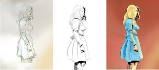
So case 1 this progressive was done with Sketchbook app for the I-Pad Pro with I-pencil.  The first image is a pen sketch.  This is where I am work strongest, with loose lines to define the form and minimal shading.  I am okay with this image, because I don’t have any expectations except to define a form and hopefully feel through an expression. The female’s facial features however were too harsh for the female I wished to portray.  I worked on the line drawing in the software to soften these features.  I also attempted to better simplify the clothing drapery. I think I succeeded on the face and have more work to do on the clothing; however, I apparently made her body profile more angular rather than the initial natural curves of the drawing. I noted too late that you need to plan out the digital inks before you commit if you wish to copy over an expressive drafting line. This is why a professional inker comes into play over good pencils. I thinks I flatten this art out too much at this stage. The final color image is a way to bring back the form with rendering shapes in the color regions. I felt I semi-accomplished this with the current direct I gave myself which was minimal.  Overall it was not a failure but a moderate gain- everything is better in color!


This next progressive- case 2- I decided to work up the draft to a more constructive point before adding a digital line- so I added a couple of digital drawing states past the initial pen sketch. The first image had a contour underlay as seen in red. I kind of use this in preliminary sketches like a scribble to fudge through a find a form. I learned this refining trick  ( called abstraction) from a caricature artist Court Jones.  You can see his instruction videos onYoutube on the PROKO channel. This helped to sure up the drawing and clarify my initial weakness of making faces and features lopsided.  This beginning drawing I like best out of the three because it looks more 3d. Note to self, identify line drawings that don’t flatten the  sketch image- ie more curves rather than short choppy strokes. Now the digital ink drawing is cleaner, but I lost a lot of volume and shape cues I created in the draft image. Again I learned too late, I should have  copied out this draft image and compared it next to the  image I started coloring on.  I would have used it as a guide to render the form so I could have gotten back some of the  volume I lost….. but as I said it always looks better in color- now if I could rendered the original sketch with color, I would be in happy town!

So all in all I felt good about my attempts and now know I can and will do better next time.
I suggest everyone  try progressives to identify challenging areas in their production work.

Saturday, July 7, 2018

new artwork posting

I started to get back to posting artwork- and will be get more dedicated to it in the vein of seeking art related jobs- I have noted a new desire to get paid using art instead of just posting things to stay current and ease my need to draw.  So hopefully I will also market this desire to get out there again and show others they can do it as well ---draw for a living.  So here come to posts....


 Note that all done in on the IPAD PRO-  using Sketchbook APP for many and Procreate APP for two of the bust images.   I will continue  learn, leverage, and  use these tools in production- I will seek to push digital art methods in the future and find other innovative methods that could be beneficial to comic production and related asset creation going further... Ciao

Sunday, April 15, 2018

Observation of the greats- Will Eisner

I have always wondered why the Pre 1960's style of comic strips and comics seemed so alien to me. They were cartoony and silly even though many of the techniques we use in comics today were inspired by those  cartoony styles- Milt Caniff,  Will Eisner and others. what I wasn't understanding is that their style along with the more ultra real styles of Hal Foster, and Burne Hogarth which we more attribute to the current comic -book style were just as skilled in their draftsmanship and design style. So I took the challenge to see what was so cool about the work. I started to just trace over an image of Will Eisner character to see what it would look like and what would be the difference. I noted he had great command of thick- to thin line work on his characters, although they may look funny to me- they had character and that's the beauty of his work. Character!... so my next task was to try to interpret one of his characters poses. Once I tried to mimic his purposeful and characteristic line-work- I found out it was not hard to recreate a look that also had character.  I also noticed that his way of scrunching up the character's pose was such an exaggeration that it even pushed out more character and feeling- more than the character I created.  This was a fantastic lesson for me and I challenge others to do the same with work that seems alien to you. It may make your work that more  a character of YOU!!!

Thursday, March 29, 2018

Re-inking over a classic-


 I wanted to redo the issue for cover 2 of FX Mulrooney originally penciled by myself and Inked by Patrick Hatfiield ( a fantastic designer and inker). This was a pure classic to say the least. I had scanned in the original into the computer with the original image and colored originally to much success. Along the way at some convention the original was misplaced and I wanted a digital version to finish the book with.  So when my computer crashed, I could only find a crappy scan made by bridging two 8.5- 11 prints together and could not find the original whole scan- not good- I could not find the original colored PSD either- I was stuck so I had to recreate the image digitally with corrections.  I am not a natural inker but I felt that I am a good tracer at best, digitally. So I made a point to re-create the image from crappy scans… I started to feel confident digitally inking only this year so I gave it a shot. I used an iPad Pro and the iPencil to create this image in Sketchbook app for the iPad. I took that Image in the Procreate App for the iPad Pro and  created the flats and rendering. I exported that image to my computer to use Gimp for final effects.  Please note that there is no app for Gimp or Inkscape for the iPad but the image would have had to been exported anyway to get into the printers hands. I used Inkscape for logo Images  and finished them in Gimp as well. This overall was a good assignment and a great new potential workflow for comics. My big gap is going to adequately create lettering in Inkscape and Gimp and learning how to input fonts into those programs- the other gap in comic production that I will have to explore is how to export to a multipage PDF for printing- But you get an idea on how to recreate an image digitally in the iPad and computer. 
Disclaimer- it will always be easier on production level  and more professional to use the Adobe toolsets- but if you are cheap like me there are options.

Saturday, March 24, 2018

rotating logo

I am trying to show this spinning logo move test2
okay this is a little buggy- but you get the picture- created with an svg in html

I can even type around this
object and use as a part of the
article- possibilities

space;