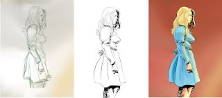
I am trying to get better with my comic art so I am working on progressive to identify my weak points in tackling a character design- from draft to finished stage. In a normal comic scenario I would only have to take the character or scene to clean draft stage. I believe I am a better penciler than I could be as a s an inker of colorist, but for my own creations I need to progress with all tasks until I have the finances and infrastructure to create a team of targeted professionals to get a professional product to the peoples.
So case 1 this progressive was done with Sketchbook app for the I-Pad Pro with I-pencil. The first image is a pen sketch. This is where I am work strongest, with loose lines to define the form and minimal shading. I am okay with this image, because I don’t have any expectations except to define a form and hopefully feel through an expression. The female’s facial features however were too harsh for the female I wished to portray. I worked on the line drawing in the software to soften these features. I also attempted to better simplify the clothing drapery. I think I succeeded on the face and have more work to do on the clothing; however, I apparently made her body profile more angular rather than the initial natural curves of the drawing. I noted too late that you need to plan out the digital inks before you commit if you wish to copy over an expressive drafting line. This is why a professional inker comes into play over good pencils. I thinks I flatten this art out too much at this stage. The final color image is a way to bring back the form with rendering shapes in the color regions. I felt I semi-accomplished this with the current direct I gave myself which was minimal. Overall it was not a failure but a moderate gain- everything is better in color!
This next progressive- case 2- I decided to work up the draft to a more constructive point before adding a digital line- so I added a couple of digital drawing states past the initial pen sketch. The first image had a contour underlay as seen in red. I kind of use this in preliminary sketches like a scribble to fudge through a find a form. I learned this refining trick ( called abstraction) from a caricature artist Court Jones. You can see his instruction videos onYoutube on the PROKO channel. This helped to sure up the drawing and clarify my initial weakness of making faces and features lopsided. This beginning drawing I like best out of the three because it looks more 3d. Note to self, identify line drawings that don’t flatten the sketch image- ie more curves rather than short choppy strokes. Now the digital ink drawing is cleaner, but I lost a lot of volume and shape cues I created in the draft image. Again I learned too late, I should have copied out this draft image and compared it next to the image I started coloring on. I would have used it as a guide to render the form so I could have gotten back some of the volume I lost….. but as I said it always looks better in color- now if I could rendered the original sketch with color, I would be in happy town!
So all in all I felt good about my attempts and now know I can and will do better next time.
I suggest everyone try progressives to identify challenging areas in their production work.


